Split Travel Photo and Watercolor Art: ChatGPT (GPT Image 2) Editorial Prompt
A prompt guide for ChatGPT (GPT Image 2) to combine a realistic travel photo with a matching handmade watercolor illustration in a vertically split editorial co
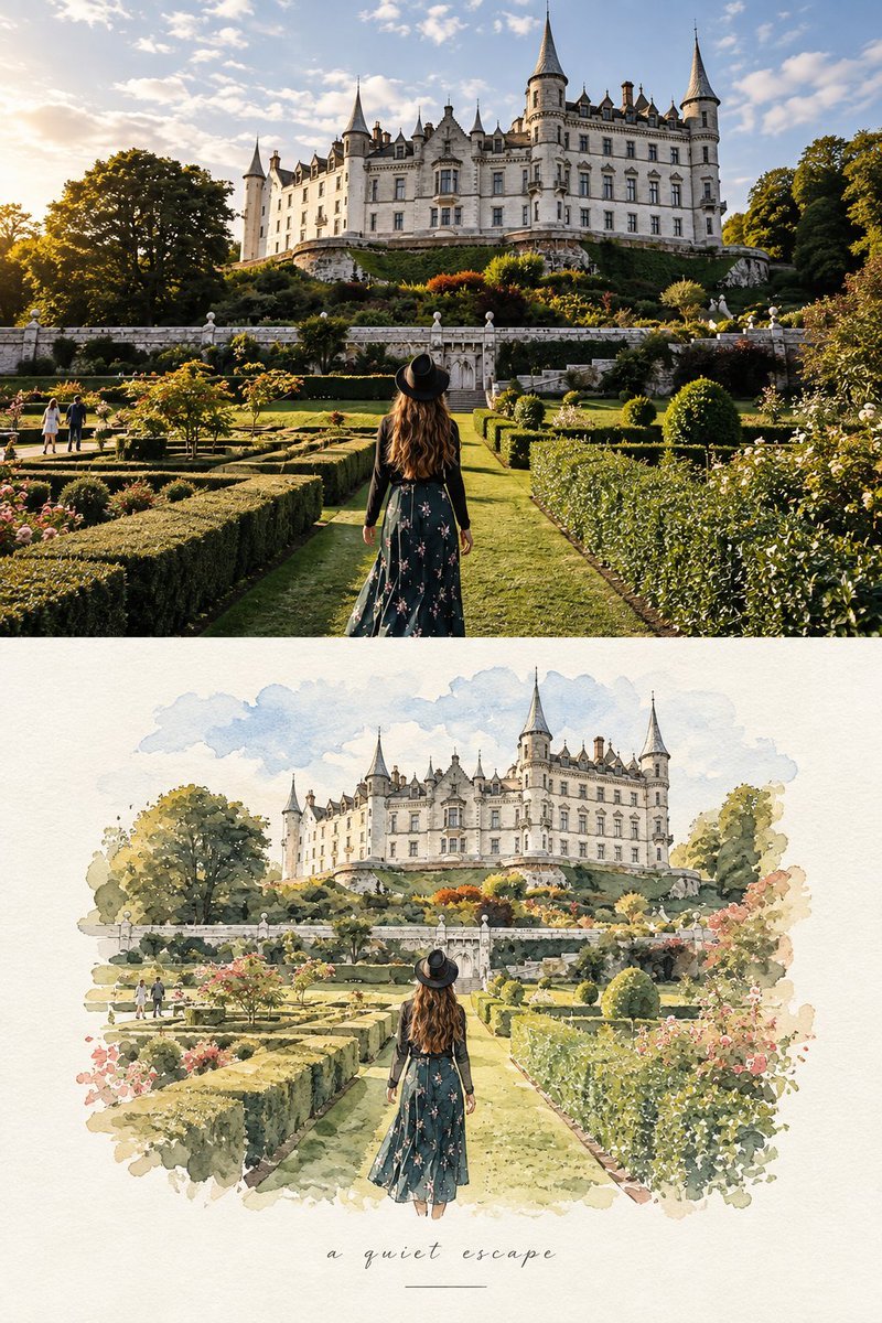
AI creator and prompt designer Lariab (@AiwithLariab) has shared an elegant editorial prompt technique for ChatGPT (GPT Image 2) that transforms travel reference photographs into striking split-media art compositions. By providing a single reference photo, this workflow splits the canvas vertically into two complementary sections: the upper half preserves the authentic, cinematic realism of candid travel photography, while the lower half recreates the exact same architecture, perspective, and walking figures as a delicate, hand-painted watercolor illustration.
Image source: @AiwithLariab on X
Combining photographic reality with painterly illustration within a single composition often leads to frustrating visual artifacts, muddy transitional borders, or severe layout discrepancies where the AI alters the architectural layout between halves. Lariab's structured prompt solves these challenges by establishing explicit spatial partitioning and strict scene-anchoring constraints, generating a cohesive luxury travel journal layout that seamlessly bridges raw documentary photography and traditional fine art.
Vertical Split Composition and Reference Consistency Control
The strength of this prompt design lies in its disciplined architectural control over the image space. Instead of allowing the diffusion model to blend mediums haphazardly, the prompt enforces a rigid structural division that keeps both halves aligned along the same perspective axes and physical layout.
- Upper Photographic Section: This half prioritizes realistic documentary travel photography over exaggerated digital styling. It explicitly requests authentic natural daylight, soft shadows, subtle film grain, tactile textures, and a sophisticated European street atmosphere. The composition emphasizes candid architectural details and pedestrians moving naturally through the scene, matching the visual language of high-end travel magazines.
- Lower Watercolor Section: The bottom half translates the exact scene into a minimalist handmade watercolor painting. It explicitly mandates preserving recognizable architectural structures, human poses, perspectives, and visual elements from the upper photo. Rather than flat digital filters, it specifies loose translucent watercolor washes, delicate ink line details, tactile handmade paper grain, soft bleeding pigments, and intentional brushwork imperfections.
- Negative Space and Editorial Framing: Surrounding the watercolor illustration with generous warm ivory or off-white textured paper creates an organic paper margin. A subtle handwritten caption near the bottom, such as “summer days” or “a quiet afternoon”, underscored by a thin minimalist horizontal line, turns the generated output into a refined travel postcard.
Full Editorial Prompt Template and Key Component Breakdown
The complete prompt provided by Lariab is designed to be pasted directly into ChatGPT while utilizing the GPT Image 2 model alongside an uploaded reference travel photograph.
Create a refined editorial travel-art composition based on a reference photograph. The image is divided vertically into two parts: the upper section is a realistic cinematic travel photograph, while the lower section transforms the exact same scene into a delicate hand-painted watercolor illustration.
Upper section: authentic candid travel photography, natural daylight, soft shadows, subtle film grain, realistic textures, sophisticated European atmosphere, documentary-style composition, people naturally walking through the scene, beautiful architectural details, slightly muted elegant colors, high-end travel magazine photography.
Lower section: a minimalist handmade watercolor painting of the exact same scene, preserving the recognizable composition, architecture, people, poses, perspective and major visual elements from the photograph. Loose translucent watercolor washes, delicate ink details, visible paper texture, soft edges, imperfect brushwork, subtle pigment bleeding, airy negative space, understated pastel tones, artistic but realistic.
Leave generous warm ivory/off-white textured paper space surrounding the watercolor illustration. Add a small elegant handwritten caption near the bottom, such as “summer days” or “a quiet afternoon”, with a thin minimalist horizontal line underneath.
Overall aesthetic: luxury travel journal, fine-art watercolor postcard, contemporary editorial design, nostalgic European summer, understated elegance, tactile handmade paper, sophisticated and serene.
Portrait orientation, clean composition, premium art direction, no clutter, no borders, natural proportions, highly detailed photograph transitioning into an airy watercolor illustration.
Analyzing the prompt's linguistic engineering reveals several deliberate constraints that prevent generation divergence:
- Explicit Geometric Division: Stating
The image is divided vertically into two partsright at the outset establishes a macro layout boundary before the model begins distributing stylistic tokens. - Strict Identity Locking: Directives like
exact same sceneandpreserving the recognizable composition, architecture, people, poses, perspectiveanchor the secondary medium directly to the primary photo, preventing the model from hallucinating different cityscapes. - Contrasting Medium Physicality: Balancing
subtle film grainandrealistic texturesagainstvisible paper texture,subtle pigment bleeding, andloose translucent watercolor washesenforces tactile separation between photographic capture and physical paper art. - Clean Boundary Enforcement: Terms like
clean composition, premium art direction, no clutter, no borders, natural proportionsprevent unwanted digital frames, clip-art ornaments, or tacky vignette artifacts from creeping into the margins.
Practical Application and Customization Strategies
Applying this editorial split-prompt to your own collection of travel photography requires a few practical considerations to maximize visual impact and compositional fidelity.
- Selecting Ideal Reference Photos: Shots featuring strong vanishing points, distinct building facades, canals, arches, or cobblestone alleyways produce the most dramatic results. Scenes with moderate pedestrian traffic work significantly better than overcrowded tourist plazas, as individual figures can be rendered gracefully in translucent watercolor washes.
- Customizing Typography and Captions: The default handwritten placeholder phrases can be easily swapped for specific locations and timestamps. Replacing “summer days” with destination-specific text such as “Morning in Montmartre” or “Kyoto Reflections” creates bespoke, print-ready travel souvenirs and personalized greeting cards.
- Canvas Aspect Ratio and Export Usage: The vertical portrait orientation specified in the prompt is optimized for mobile displays, editorial lookbooks, Instagram story covers, and physical postcard formats. The generous negative space at the bottom also provides ample room for further digital typography or branding overlays.
- Palette and Mood Variations: While the base prompt emphasizes nostalgic European summer and muted pastel washes, creators can shift the atmospheric tone toward vintage sepia tones, moody twilight blues, or monochrome ink washes by adjusting the color descriptor clauses.