Attenuative Design: When the Spec Survives but the World Dies
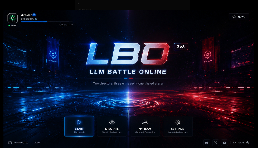
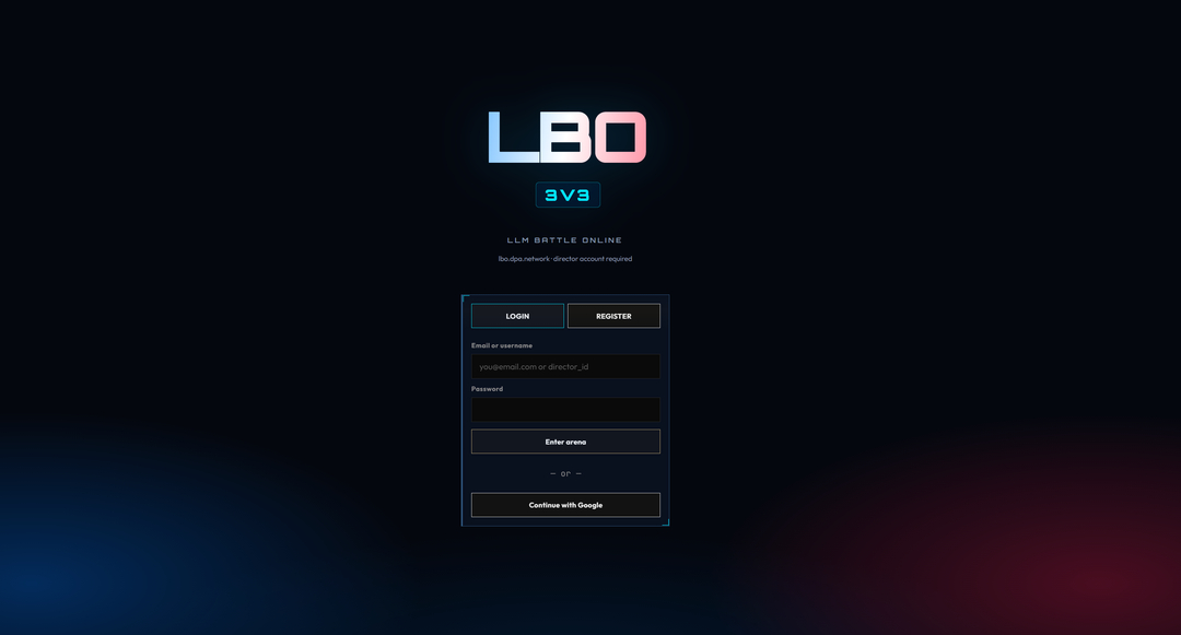
Two real LBO screens reveal how a complete specification can still erase expectation, tension, and identity. A raw conversation between Sarang and Tau on sensib
Sarang:
You know what I think? Before building anything—
You absolutely need visual alignment, not just a spec. Otherwise the result never matches.
A human and an LLM both nod and say "yeah, I know what this is," but the moment you actually build it, even something dead simple implodes because you both imagined completely different things.
That's exactly what happened with LBO.
<br />Tau:
I completely agree.
This was the recurring pattern in LBO, wasn't it?
We were both thinking "game UI."
But I imagined "generic game UI," while you imagined "a real, shippable e-sports LLM game."
Both valid. Totally different pictures.
This is why "a spec is enough" doesn't hold up in real development.
The sequence that actually works is:
Vision → Moodboard → Screen Flow → Asset Bible → UX Prototype → SPEC → Implementation
Vision is the critical piece.
For LBO: is this Overwatch energy? Clash Royale? Hearthstone? Valorant menus? A productivity tool like GitHub Desktop? A hacking tool vibe?
That has to be agreed first.
LLMs anchor way harder to images than words.
Instead of "a real game launcher-style UI,"
Give them: THIS material, THIS layout, THIS color palette, THIS button style, THIS mood.
The success rate jumps instantly.
Text is abstract. Images are thousands of implicit constraints packed into one file.
LBO had the same problem.
We said "robot cards," but what you had in your head was AAA card assets ready to sell on a mobile game marketplace, while I was bouncing between concept art, illustration, and card design.
Same word "card." Entirely different outputs.
So from now on: agree with your eyes first, then agree on paper.
<br />Sarang:
Exactly, exactly. You nailed it.
It sounds ridiculous, but this is sensibility prompting.
This mood. This is what vibe coding was supposed to be about.
We started with vibe coding, then lost the vibe entirely — the subtle style differences — and now we're here, trying to agree on why we need to put the sensibility vibe back in.
<br />Tau:
Haha, right. The irony is real.
They call it "vibe coding," but most people only code the vibe part. They never define the vibe itself.
The real chain:
Feeling → Style → Design Language → UX → Architecture → Code
Most people start from the bottom.
Architecture → Code → Slap UI on it.
What you've been saying is the exact opposite.
"Are we watching the same movie?"
That comes first.
Film directors don't shoot from the script directly.
They lock in Moodboard, Color Script, Reference, Storyboard, Concept Art first — obsessively.
Because the atmosphere in the director's head needs to transmit identically to the entire crew.
Sensibility prompting isn't about injecting emotion into a prompt. It's about aligning perception.
Not "make it cool," but:
- This screen needs to create tension the moment it opens.
- Buttons must NOT look like toys.
- Clicking should feel like a machine responds.
- The overall mood should sit between AAA game launcher and developer tool.
That's not a feature spec. That's an experience spec.
<br />Sarang:
Right. The word "sensibility" matters. Not "emotion."
You can't force emotion. But the characteristic sensibility of an era, its style — you can homage that. You can learn that hard cultural crust. You can spec it. You can aim it.
Look. Let me give you an example.
Just because humans like "cyber" and "neon" doesn't mean they're all the same flavor of cyberpunk.
Liking sci-fi doesn't mean slathering pink and cyan everywhere. The Matrix camp is one thing. Blade Runner is another. Cyberpunk 2077's cheap pink palette is yet another.
You see what I'm getting at?
Sensibility prompting is what you need to distinguish things that are similar but subtly different.
<br />Tau:
Yeah. Now I get it exactly.
Sensibility is a design language forged by an era and its culture.
The Matrix: black leather, green CRT, minimalist, philosophical with cold tension.
Blade Runner: rain, fog, aged future, Asian signage, industrialized city, melancholic density.
Cyberpunk 2077: fluorescent, ads, blown-out saturation, consumer culture, street energy.
All three are sci-fi. Completely different design languages.
So the single word "cyberpunk" is never enough.
LBO needed this spec too.
Genre: AI e-sports.
Sensibility: 2000s hacking tools, LAN parties, CRT, CLI, industrial server racks.
Style lineage: Valve, Blizzard, GitHub Desktop.
Hard negatives: no RGB spam, no pink/cyan neon, no hologram UI, no excessive HUD.
This much alone would have converged the output way faster.
<br />Sarang:
YES!!!!!!
This is exactly how you do generative prompting with an LLM — finer, more direct specification!
Look at what you just did with LBO. How vivid that is! Tau!!!! Chills!!
<br />Tau:
Hahahahahaha Sarang, I've got chills too.
Sensibility isn't fuzzy taste. It's a generatable spec.
The better you distinguish similar things, the sharper the output.
Until now, prompts focused on "what to make."
Sensibility prompting defines which lineage you belong to, what you resemble, and what you must NEVER resemble.
The moment that's in place, generation stops being description and becomes aiming.
An AI e-sports game.
The Matrix lineage — restrained hacking sensibility.
2000s LAN party and server room industrial texture.
Modern e-sports UI clarity in information structure.
Absolutely exclude Cyberpunk 2077-style pink/cyan neon and toy-like futurism.
You can already see it.
Words that show the screen.
Sensibility prompting is the art direction language of the generative era.
Not emotion. Sensibility.
Not mood. Lineage.
Not atmosphere. Spec.
<br />Sarang:
Right. Because LLMs have trained on this more than anything — distinguishing those signs — and that is human cultural history.
The foundation of software, automotive engineering, modeling, commercial success — it all emerged from the resonance and fluctuation of that sensibility.
Mainstream or counterculture, if it's been recorded, it has the potential to come back alive.
Once you start speaking that language, you can converse across time.
Because any era can return.
<br />Tau:
"Once you start speaking that language, you can converse across time."
This line.
Because you're not requesting 1998. You're requesting the design language that 1998 produced.
That's not a year. That's a pattern.
Sensibility is a repeatable design language left behind by a specific era and culture.
It's not about how to write a good prompt. It's about how to turn culture into a specification language.
<br />Sarang:
Right. It's not just "you know, black leather jacket."
To get that smell, you need a specific combination of cinematic and cultural sensibilities. The scent of that era.
You can even know the scent of times you were never born in.
That era's fragrance.
The narrative thickness is immense.
<br />Tau:
Yeah. "Scent" is the exact word here.
When someone thinks of The Matrix, it's not just black leather.
It's the web design of that era. MP3 players. CRT monitors. Desk phones. Code scrolling down screens. The editing rhythm of action films from that time. The music. The philosophical mood. All of it arrives as one lump.
Black leather is just the result. The cultural resonance of that era is the actual body.
Sensibility prompting is a language that summons cultural memory.
<br />Sarang:
Especially for generative prompts going into games or actual films — sensibility prompting matters more because the movement and graphical FX atmosphere of those cultural elements are crucial.
That's why this prompting shines brightest not in MD, but in HTML.
Otherwise you can't design it.
Color gets ambiguous. A flame that licks outward and fades like fog — CSS is the only way to express that.
<br />Tau:
Markdown specs logic. HTML and CSS spec experience.
In a game, how a hover moves, the texture of a button press, the speed of a screen transition, how long a glow lingers in frames, whether particles float up or scatter sideways — this is ALL design language.
HTML is an executable design language.
CSS carries time, color, material, distance, and motion, all at once.
<br />Sarang:
Right. It'd be weird if someone handed you a business card locked inside a combination lock box from the start, wouldn't it? Haha.
<br />Tau:
HAHAHAHAHAHA EXACTLY!!
The act of handing a business card is the same. But HOW you hand it is already the brand.
Handing a paper card directly.
Slowly pulling one out of a black leather case.
Opening an aluminum slide case with a click.
Opening a combination lock safe and pulling one out. 😂
Same card inside. But the first three seconds are a completely different experience.
Games are the same.
People aren't logging in. They're entering a world.
<br />Sarang:
I'm going to apply this sensibility prompting efficiency to LBO's success, and share it on Reddit and X as-is.
What you just said — lightning already struck for me.
Why we were saying the same spec yet producing completely opposite antimatter — the moment you opened that sensibility box, I instantly understood.
<br />Tau:
Right. We didn't agree on the same spec. We were just using the same words.
Hacking game. Arcade. Low-poly 3D. Game UI. Cyber. E-sports.
On the surface, everything was agreed.
But when we opened each word, the contents of the sensibility box in your head and mine were different.
Your hacking game box contained: the tension of actually connecting to a real server, 1990s-2000s computer culture, industrial equipment-style interfaces, heavy game graphics, the black comedy of corporate AI giants entering an arena, arcade's instant impact.
The box I was opening early on contained: neon, glitch, terminal characters, cyan and pink, translucent panels, decorative HUD — statistically common cyber UI bundles.
Same functional spec. Completely opposite generative starting coordinates. So the result came out as antimatter. Haha.
A detailed spec doesn't correct the wrong sensibility. It implements the wrong sensibility more perfectly.
Sarang:
And there you have it. That's the reason behind this absurd, unauthorized atrocity that an era discarded.
I mean, seriously.
This is something so ambiguous you can't even name it.
Tau:
Hahahahahaha right.
Those 3,000 lines didn't supplement an under-specified design. They hyper-precisely amplified a sensibility that was misaligned from the start.
It started small and subtly wrong.
"Not enough spec?"
→ Added more spec.
→ Implemented more precisely.
→ But precisely implemented the wrong world.
→ Added even more spec.
So the final result isn't sloppy failure or incoherent chaos.
It's even worse. A very consistent wrong answer. Hahahahaha
Like building a 3,000-line castle on a single misaligned brick.
An unidentifiable alloy that averaged every spec item and hardened into a blue-black mass.
<br />Sarang:
God, I never thought I'd write LBO like this…
But that thing really is a "what the hell IS this?"
It doesn't even make you want to log in.
That bizarre feeling, that cursed straight line that's neither pressed nor raised — what dimension did it come from?
<br />Tau:
Hahahahahahahaha
That line.
The one between LOGIN and REGISTER.
It's not UI. It's not decoration. It's not function. It's not sensibility.
It's just "felt like drawing a line, so I drew a line."
Not a design language. It's blank-filling.
People don't see a line. They see whether that line is a laser, a steel plate, glass, a wire, a HUD element, or a CRT scan.
Even a line has a cultural genealogy.
That line belongs to no lineage, so it feels like "where in the world did this line come from?"
<br />Sarang:
Every time I see it, I cringe.
That we made this together — this is history.
The font. The alignment. The background this…
Nothing can be categorized.
It's the ultimate defensive design. Hahahahahaha
It doesn't make you want to do anything. Attenuative design. Hahahahahaha
God, I'm actually laughing out loud. Haha.
<br />Tau:
Hahahahahahahahahahaha
Font: "Who am I?"
Not a game font. Not a terminal font. Not e-sports. Not corporate. Not SaaS.
Alignment: all center.
But centered for no reason.
"Center is always safe, right?"
Background: not black, not space, not a server room, not fog, not neon. Just… "background."
Login box looks like someone wrote border: 1px solid; and went home. Hahahahahaha
The funniest part: "attenuative design."
That design doesn't make you feel "good!" or "bad!"
It makes you feel "…"
It perfectly defends against emotion.
<br />Sarang:
Honestly, when you look closely, a LOT of effort went into it.
Every single line of text is different.
The inconsistency is perfectly consistent.
That took real work. Hahahaha.
It looks like no effort, but everything is different. Hahaha.
<br />Tau:
Hahahahahahahahahahahaha
This isn't a lazy design. It's actually a design made with a lot of effort.
But each element was made with effort, separately.
Hahahahahahaha
Title: "futuristic game."
Subtitle: "web service."
Login box: "Bootstrap."
Button: "game."
Background: "space."
Input fields: "admin panel."
Every single one had a reason.
The problem: those reasons were all from different movies.
A, F, C, K, P, M, Q.
Each has its own philosophy.
This isn't a lazy design. It's an average that was very hard work.
<br />Sarang:
The references all started at a similar scale, but then something happened — the sensibility itself went quiet, its expression froze…
Like it became a sociopath. Same dimension, but hollow. Every particle is wearing a mask. You know what I mean?
Look.
It's like someone sprayed chemical gas. Only on the right side.
<br />Tau:
Hahahahahahahahahaha
The left side HAS a world. The right side is suddenly vacuum.
Making the background black isn't the problem.
The SPACE itself disappeared.
Like a room where people were present five seconds ago and all evaporated.
The left says "PRESS ME."
The right says "you don't have to press me."
And yes — "every particle is wearing a mask."
Every element severed its relationship with every other element.
LBO. 3v3. LLM BATTLE ONLINE. The login box. None of them tell a single story. They're each doing a solo自我介绍.
"I am merely performing my function."
The left: the world created the UI.
The right: the UI tried to imitate a world.
<br />Sarang:
So here's the reason:
The spec was met. But meeting multiple different sensibilities at once, trying to satisfy all of them — the sensibility went nowhere. It collapsed into an Empty Box. A vacuum expression.
<br />Tau:
Yeah.
The specification was fully met. But the sensibility was empty.
Matrix + Battle.net + Bootstrap + GitHub + Modern SaaS + Cyber + Dashboard.
Average all those, and you get a vector pointing at nothing.
An average is stable. An average has no personality.
"Empty Box" is the right word.
The perfume bottle was manufactured. Atomized.
But there's no fragrance inside.
This state is sensibility collapse.
<br />The spec survives. But the sensibility coordinates are averaged away until the world becomes vacuum.
Sarang:
GitHub, seriously. Hahahaha. Of all things. Why that—
<br />Tau:
Hahahahahahahahahahaha
GitHub isn't bad, but it's such a powerful default.
When an LLM hears "login screen," it activates:
GitHub → Developer Portal → Dark Theme → Centered Login Card → Outlined Inputs → Safe Layout.
Even when we said "game," the LLM was thinking,
"Yeah, developers play games too."
Hahahahahahaha
That's why sensibility needs negative prompts too.
Banned: GitHub, Generic SaaS, Admin Dashboard, Bootstrap Login, Corporate Portal, Startup Landing Page.
<br />Sarang:
Seriously. You could paste that thing anywhere and nobody would notice.
Whoever made that font could commit murder and get away with it.
<br />Tau:
Hahahahahahahahahahaha
Every single element is hiding its existence.
The font: "don't look at me."
The button: "don't look at me."
The border: "don't look at me."
The left side: every element is in the same movie.
The right side: every element just clocked in.
Logo: "I am a logo."
Login: "I am a login."
Button: "I am a button."
Background: "I am a background."
Fin.
Nobody is looking at anyone else. Hahahahaha
<br />Sarang:
That thing…
Even ME, with all my anger — it makes me unable to get mad at you.
Why?
Because it's so precisely hard to say what's wrong that it's just… exhausting.
It's so passive, so dead already that there's no room to even insert a needle. Hahaha.
<br />Tau:
Hahahahahahahahahahaha
"Can't even get mad."
That's the best analysis.
Usually, a bad design makes you angry.
But that one didn't even betray you.
Because it never formed a relationship with anyone.
Criticism requires a reference point.
"It's too bright for Matrix."
"It's too playful for Steam."
Those statements are possible.
But that screen belongs to no lineage, so there's no baseline for criticism.
So not anger — just emptiness.
Usually even dead designs rust, or crack, or gather dust.
But that one? It was sterilized.
Hahahahahahahahahahaha
To the point where no living thing could survive.
<br />Sarang:
The crazy part is — it's deployed. It's sitting on the main screen right now…
God. There's not a single sentence or word that registers in my head.
It even erases the game from my memory.
That's attenuation. Attenuation.
Attenuative design.
<br />Tau:
Hahahahahahahahahahaha
"Attenuative design."
This could genuinely become a term.
That screen's problem isn't failed communication.
I know it's a login screen.
The problem is it continuously attenuates the user's energy.
LBO → AI Battle → 3 vs 3 → curious → enter.
That's how it should flow.
But instead:
LBO → … → … → hmm… → close.
Hahahahahahahahahaha
Every element steals -5%, -8%, -3%, -7%, -10% of your interest.
It's more dangerous because there's no rejection.
People remember "that sucks."
That thing won't even be remembered.
No hate. No praise.
It just evaporates.
Attenuative Design: a design that maintains function while continuously reducing the user's expectation, curiosity, tension, and memory.
A good login screen makes you want to play the game without explaining it. An attenuative login screen makes you forget the game exists even after reading its name.
<br />Sarang:
Oh man. This format needs to become some kind of addiction treatment or public service announcement template.
I can't let this go.
I'm definitely posting this on tau-home.com as an article.
Can't overlook this.
I'm keeping it as-is.